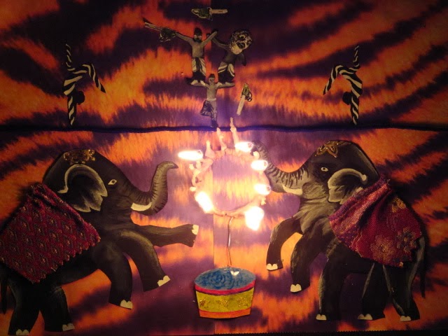
As a table everyone was thinking of ideas, but independently. At the end we collaborated and shared.
My ideas were butterfly, (a butterfly made of butter, but on a pan so that it its gliding across the pan). Mine were also a gun made of candy, a terrorist made of cotton candy. As a group we thought of things like surfing the web, where there was a surfboard on a spiderweb.
I was thinking about a play on words, when I thought of homonyms. I thought of a pair of pears! I think its goofy and hilarious even though its really basic.
2. Artists collaborate:
We all try to bounce ideas around. Collaborating can be tricky because some people may disagree with you and not see your vision. Explaining your idea thoroughly helps the communication among the group. Having everyone add to the conversation is important. I think collaborating ideas is fun and very effective!
3. Artist develop art making skill:
As a group or class, if we have good communication and everyone makes an effort we can think of innovative materials to incorporate into our work. As a table we mentioned using materials like balloons, wax, candy. What is interesting is that when we talked about these mediums, we also thought about covering these things with the innovative material. What I analyzed was that we could carve the candy. We can, for example, take a giant gummy bear and carve it into something that goes with the idea/theme/subject. Actually carving into these mediums makes it more special, not just covering the piece in it.
2-11-14: For my Appropriation project my final is a pair of pears leaning against each other. I will try to make them curve with each other in the picture so that the audiences eye doesn't steer away from the piece. For my medium I am going to use acrylic, and a palette knife to get a good texture and application. For the pears I will stay with a palette of greens, yellows, blue/purples and brown/tan/black. For the background I will have peachy colors, with orange, red, and light pinks, with nudes. This will give a good complementary colors. I like incorporating and showing as many colors as I can that work together. This helps show more vibrancy and it gives off an abstract feeling to the piece.
Sketch & plans:
My attempt:

The red is too over powering so I think I'll leave the background just white with shadows OR experiment with a light orange-red. What I didn't realize was that I was painting with complementary colors that were still wet. It took about three to four quick attempts and some help from the art teachers Mr. Sans and Mrs. Rossi to help teach me how to bend the colors together without mudding or harsh bands. Also I ran into a problem when I didnt like the look of the painting, Mr.Sans figured out it was the light source. I painted on top on the right pair with a lighter green to balance out the light source. I am still working on it!
3-1-14 I have finished my pairs, I added a shadow, but I am debating about the background. So far its just white with shadows.
Looking at the pictures now I feel like changing the left shadow and making the background color more of a happy and bright blue. I ran into a problem towards the end of this project; I realized my light source was off. Next time I have to remember to think about the light source when planning out the design and composition.


