Monday, March 3, 2014

Chick The Skeleton

While Mr.Sans and all the other art teachers were gone I worked on some charcoal drawings with Jessica. Mr.L was the best substitute and he even gave me some good advice for my drawings.
This was just casual sketches not a long project:
here i used pastels to make a butterfly wing->


skull & pelvis. The hardest was the pelvis because of the texture, cracks, curves, and indents. :

I liked this one because i was familiar with the cylindrical shape. femur->

Tuesday, February 11, 2014

Appropriation Project: A Pair of Pears

1. Artists create original artwork:
As a table everyone was thinking of ideas, but independently. At the end we collaborated and shared.
My ideas were butterfly, (a butterfly made of butter, but on a pan so that it its gliding across the pan). Mine were also a gun made of candy, a terrorist made of cotton candy. As a group we thought of things like surfing the web, where there was a surfboard on a spiderweb.
I was thinking about a play on words, when I thought of homonyms. I thought of a pair of pears! I think its goofy and hilarious even though its really basic.

2. Artists collaborate:
We all try to bounce ideas around. Collaborating can be tricky because some people may disagree with you and not see your vision. Explaining your idea thoroughly helps the communication among the group. Having everyone add to the conversation is important. I think collaborating ideas is fun and very effective!

3.  Artist develop art making skill:
As a group or class, if we have good communication and everyone makes an effort we can think of innovative materials to incorporate into our work. As a table we mentioned using materials like balloons, wax, candy. What is interesting is that when we talked about these mediums, we also thought about covering these things with the innovative material. What I analyzed was that we could carve the candy. We can, for example, take a giant gummy bear and carve it into something that goes with the idea/theme/subject. Actually carving into these mediums makes it more special, not just covering the piece in it.

     2-11-14: For my Appropriation project my final is a pair of pears leaning against each other. I will try to make them curve with each other in the picture so that the audiences eye doesn't steer away from the piece. For my medium I am going to use acrylic, and a palette knife to get a good texture and application. For the pears I will stay with a palette of greens, yellows, blue/purples and brown/tan/black. For the background I will have peachy colors, with orange, red, and light pinks, with nudes. This will give a good complementary colors. I like incorporating and showing as many colors as I can that work together. This helps show more vibrancy and it gives off an abstract feeling to the piece.

Sketch & plans:


My attempt:


The red is too over powering so I think I'll leave the background just white with shadows OR experiment with a light orange-red. What I didn't realize was that I was painting with complementary colors that were still wet. It took about three to four quick attempts and some help from the art teachers Mr. Sans and Mrs. Rossi to help teach me how to bend the colors together without mudding or harsh bands. Also I ran into a problem when I didnt like the look of the painting, Mr.Sans figured out it was the light source. I painted on top on the right pair with a lighter green to balance out the light source. I am still working on it!

3-1-14 I have finished my pairs, I added a shadow, but I am debating about the background. So far its just white with shadows.
The base ->

almost done, not quite there ->
added a light blue and shadow, trying to control painting w/ just one/ two light sources-->

zoom in-->
march 14th-->
Looking at the pictures now I feel like changing the left shadow and making the background color more of a happy and bright blue. I ran into a problem towards the end of this project; I realized my light source was off. Next time I have to remember to think about the light source when planning out the design and composition.


Tuesday, February 4, 2014

Art3: Tension

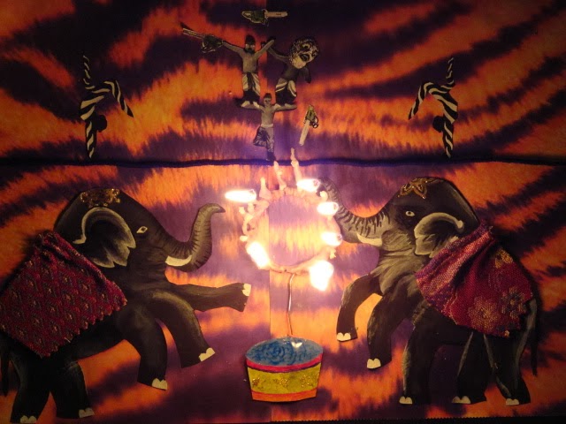
With the tension theme I chose to go with a circus setting, and having people balance on a tightrope on one foot while having two people on their arms juggling chainsaws on fire. So far my materials have been wire, black yarn, fabric, printed paper, and acrylic. I tried to show a symmetrical compositions but putting elements in it that would throw off the balance. For example, the person on the top right is positioned to reach something, because I will later draw/paint in chainsaws on fire, but this juggler lost balance and drops the chainsaw, creating the tension. Also the elephants have different patterned fabrics. The elephant on the left has three arms but the elephant on the right has three legs.
Later I am going to add two more people on the left and right of the tightrope. I am debating where to have them positioned as semicircles or at about 45 degree angles in so their bodies would point to the bottom center of the picture to show the triangle in the composition.

Still working.. its taking FOREVER!!


 I added glitter glue, and made a candle sort of thing for the ring of fire. Maybe I can change Mr.Sands perspective on glitter.


The first try on the candle idea failed... :(


To fix this I tied strings around the ring and went through several coats of wax. I also made sure to make the string wicks longer to make it last and have something thick for the wax to adhere.

Yay finally; the fire element worked!


1. Artists take risks:
While in the process of creating the design, I loved the idea of the ring of fire. I feel that the ring of fire at a circus adds so much tension. I really wanted to add it to my piece, but I didn't think it was possible. After I finished the actual painting, I thought the project still needed something more. Fire! I went back to thinking more about the fire element. Birthday cakes inspired the design of the the ring of fire. Using wax, wire, and string I made a candle sort of piece to be the ring of fire.
This was a big risk because it could have burned my whole project. I had never used any other type of medium than things I could control. Controlling fire can be very dangerous, but it all went smoothly.

2. Artists communicate through their work:
Conveying the feeling of tension can be taking different routes. Typically disturbing or odd pictures can cause tension. Other times you could paint things thats a big problem. One of my ideas was painting a scene from a third world country, or poverty. Those tense subjects would definitely be see through the art piece. But then when someone mentioned "tightrope"  ideas starting coming. A circus, fire, 5 foot animals, chainsaws, representations of the thrill and tension in a circus. They all create tension in a busy circus that leaves an audience in awe.

3. Artists solve problems:
As mentioned previously the first attempt on the ring of fire didn't work at all. This didn't make me feeling like quitting on the ring of fire, because there had to be someway to make it work. My motto is "What like its hard?" so I just needed to make a new one. I just melted some wax, got some string, and with the help of Mr.Sans (an expert at candle making) I was able to make another ring of fire before class ended!

Art 3: Sketch idea 1


For this idea of incorporating text into art, my group and I thought of many ideas. We thought of painting a person spray-painting a brick wall, but having the colors from the spray can come out as colorful words like "art", "inspire", "express", "color", "orange". There was also the idea of training dolphins to jump at certain curves and positions so that when they would all jump a word would appear. Then there was the idea of using shoelaces to spell out a word on converses, which lead to the idea of the sketch above. The idea of using string or laces to wrap around objects. So an example of doing this was sketched out. The way this would work is to have the supporting strings the same color as the object to let them camouflage, but having a bright color standout but only have this color on the lines and curves that would spell the words.

Saturday, January 11, 2014

Book Carving

Prompt: Explain how you developed your design for your book carving. How important was it to have a clear plan before starting? 
 I spent more time researching book carvings and finding ideas then carving the book. Since you are cutting, you want to make sure that you are 100% sure that you are doing it right. Once you cut it, its unattached forever!!
There are hundreds of styles to carving your book. There's a panoramic, outside carving, taking several books and carving, pop-out, or carving it inside. I thought about doing the panoramic style, but the directions didn't make sense to me.
I chose the pop-up style, because it was different then everyone else's. Also, I wanted to have enough time for detail and being careful when cutting, and this style is less time consuming as far as planning goes, which means that I was able to just cut. The other style seemed four times harder, because once you cut something wrong you had to tear out that number of pages, and the process was incredibly confusing. I knew that I wouldn't have had enough time to focus on the details and making the paintings and cuts intricate. 
My idea process:
With the panoramic style in the beginning, I thought it would be great to not make little carvings to make images in the book, but actually make carvings in it to make the book become an image.
Something in a panoramic shape would be a carousel. My birthday was coming up around this time the project started. When I was younger I had this little fancy carousel jewelry box, I got it for my birthday, but it was stolen when our house was broken into. So I thought that if I did the panoramic style I could make it one big carousel! Once I started trying to plan and research instructions, it became really hard. I had to cut every page of the book in order for this to work. I wanted there to be different designs on every page because thats how I would be able to make the carousel. I had to think of something else.
My second favorite style was the pop-up book! So I went with it. I wanted to still incorporate the carousel, so I thought about continuing the amusement theme, and make a fair, but I thought it would make it cuter by adding some feeling so I thought adding a couple kissing and the Eiffel Tower would make it special.
 
What were the challenges you faced when working on this project? Explain how you overcame them. 
 The most challenging part is curved lines! Curved lines are hard, and take time to do right. To overcome this obstacle I had to go little by little, and practice on tracing, so that I was comfortable with the lines, so I knew the shape better. 
I went through planned out steps: 
1) think of a theme 
2) choose a style and make your layout and design
3) cut tracing paper, proportional to the book (to the area you will be cutting). Practice your final design on the tracing paper. This is the time to add things, or adjust the design.
4) lay the final tracing paper over the book and cut away!
5) add paint, found materials, etc.
 Done! (touch lines up here and there with the exact-o knife)
 
Discuss your design and how it relates to the book you chose (if that was the case, if not just discuss design). Did you take any risks? How and why? 
 The book I used was actually a dictionary. It didn't relate to my carving, which was Love in Paris (a summary title for my book's theme). 
I did not take any risks with this project. Honestly, I am not understanding how to take risks.

Describe how you felt about the overall project and if you felt it was successful. 
I felt good about my project. It was what I wanted to do, and how I imagined it, even if I did not take a risk. I always feel like I can add more to it, but it never works out. I wanted to have lights on it, but there was no way it was going to fit on to the book. There's more that I could've done to make it stand out. My favorite part is the painting. I spent time on it and I was careful with it. Painting it made it look so much better! Also I am glad that I was able to put in a plastic wrap paper to make the water in the river. It looks really cool and realistic when the light shines on the plastic.


Wednesday, December 18, 2013


1. How did you show amusement and variety in your piece? Explain your choice of subject matter and how you created a unified piece of art.
I showed amusement and variety through my piece by incorporating pictures of what makes people all over the world pleased, or amused. My choice of subject matter was making a paper maché Earth and covering it with things that show different cultures, politics, and languages from different regions, but I unified them by having the pictures be related to one another. For example, in Iraq I put a picture of terrorists holding a poster threatening to kill all Americans, but in America I put a picture of Barack Obama on the news with the caption saying "Osama has been killed". I also, included a picture that reads 'Made in China" and I put it on America as well to show that a lot of our things come from there and that we run on material shipped from China to here. This demonstrates that all countries and continents all have relationships with another, and that the world is inner-twinded and unified.
2. Describe your experience with using mixed media. What mixed media did you use for your piece? 
I used paper maché, colorful teared pieces of paper, hot glue, yarn, print outs and I was supposed to use wire but it didn't work, because the surface of the globe was so bumpy that trying to make roller coasters out of wire was not working or adhering. 
3. What role did our lessons on visual journals play in the success of your piece? Explain.
 The layering, and taking pieces from different magazine cut outs to make one picture where the objects worked together to create a new picture/setting, both worked in my ideas and I used them to make my project. In Antarctica I found a picture of two penguins holding hands, so I looked for a proportional veil, bouquet, and top hat for the penguins to wear to let the audience assume they were husband and wife. I also used that technique, for Australia. In a magazine I found a picture of a trampoline, and then it gave me an idea to print out small kangaroos and place them on top to make it seem as if they were really jumping on it.
4. Discuss any challenges you experienced and how you overcame obstacles. 
My biggest challenge was the wire and trying to come up with more materials/mediums. At first when I tested out the wire out, to shape it like a roller coaster it worked but I was disappointed when I actually was ready to adhere it to the globe, because it would not stay. I tried gel, poking a hole to place it in, turning it certain ways, and hot glue. I was surprised when the hot glue wouldn't hold it, but I realized it was the height of the globe and the wire weight that were really unporpotional, which made it so unstable. Eventually after my several attempts to try and make the wire stay in place, I had to work on something else and just let the wire go, because it was starting to become a waste of time. So finally instead, I decided to spend that time layering and covering things up and trying to make sure there weren't too many blanks on the globe. At the end my projected looked okay, but I still think that I could have done better. If I would have known the wire would not work I would've tried something else before I ran out of time. 
My main goal in this project was to show the joys and pains that amuse people. What some people find amusing causes other things pain and suffering, in this the world in constantly in cause and effect, where one thing you do effects another person or thing. This shows how the world is unified through our everyday challenges, most joyous or saddest moments, and cultures.

Friday, November 15, 2013

Untraditional Portrait


1. Who did you choose to do a portrait of? Why did you choose that person?

I had to choose a family member to do a portrait of, and the only person who let me was my brother, John.

2. When brainstorming about this project how did you decide what would be the best materials to use to create it? Explain how your material choice impacted the look of your piece. Why was this so important. Explain.
We were not allowed to use paint. So, when listing the materials that I could use for this project, I decided to pick a medium that would be textutral. Honestly, I wanted to pick something that was not costly. My other ideas were cereal, melted wax, using pictures of that person to create one big picture of them, etc. One of my classmates had already choosen wax, and cereal was boring, and using mini- pictures was too challenging. Then, I thought about cakes and how I've seen pictures of people made of icing on the cake. Icing was in my budget, and it allowed me to incorporate a textural element.

3. Describe the risks you took or that were involved in creating the project. What were the challenges you faced?
I challenged myself by only buying red, blue, and yellow so that I could make my own colors and have every part of the face different from the rest. After coming up with so many colors it was hard to create new ones. Also, I wanted to have a color that represented lights, and a different color to represent darks, so that this way I could have value even though I was not using any black or white.

4. How did your choices impact the look and feel of the piece? Did your choice of materials have any connection with the person you chose to represent?
The choices I made to impact the feel of the piece, such as using bright colors and all of them different, gave it a fun and bright look. My subject was an old picture of my brother when he was about five to six years old, so the colors that I used in my piece gave it a youthful feel as well. The materials I used did not have any direct connection with John.